 "Sam" (samwellington)
12/11/2016 at 03:52 • Filed to: None
 1
1
 14
14|
"Sam" (samwellington)
12/11/2016 at 03:52 • Filed to: None | 1
| 14 |
Is the A in the Jalopnik logo supposed to be a road extending into the distance?
Because I want to believe that it’s a road extending into the distance.

 Bman76 (hates WS6 hoods, is on his phone and has 4 burners now)
> Sam
Bman76 (hates WS6 hoods, is on his phone and has 4 burners now)
> Sam
12/11/2016 at 04:04 |
|
I’ve always thought so.
 Wobbles the Mind
> Sam
Wobbles the Mind
> Sam
12/11/2016 at 04:05 |
|
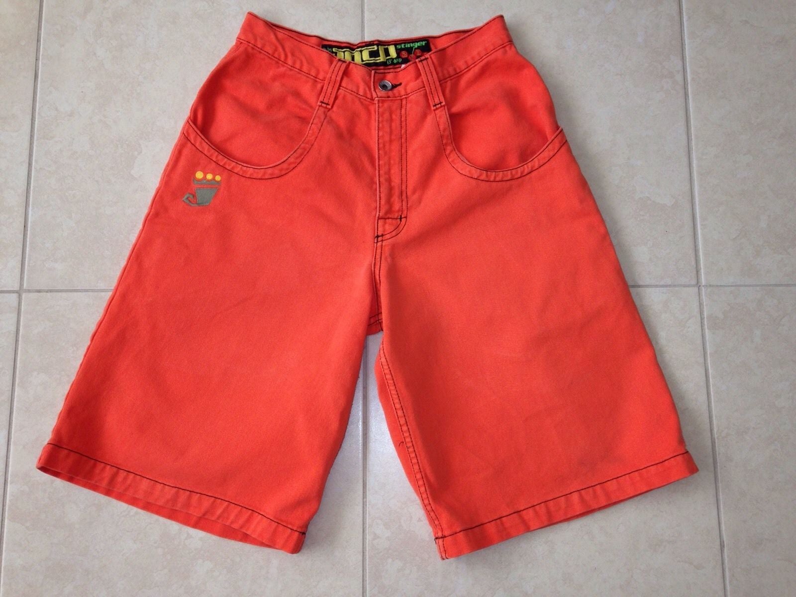
Nope, the A is pants. Mike Spinelli loved his JNCOs.
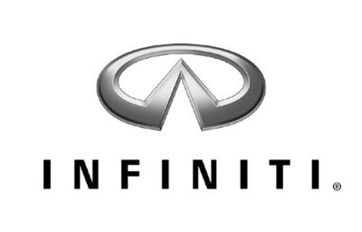
We wanted it to be a road heading off endlessly into an unknown but exciting future until Infiniti hit us with a lawsuit.
 pip bip - choose Corrour
> Sam
pip bip - choose Corrour
> Sam
12/11/2016 at 06:27 |
|
maybe a drag strip?
 LongbowMkII
> Sam
LongbowMkII
> Sam
12/11/2016 at 08:17 |
|
It’s supposed to be not a stupid orange color. Bring back chrome
 Manwich - now Keto-Friendly
> Sam
Manwich - now Keto-Friendly
> Sam
12/11/2016 at 10:27 |
|
No... the A is the road to Project Car Hell... I wish they would bring back PCH.
 XJDano
> Manwich - now Keto-Friendly
XJDano
> Manwich - now Keto-Friendly
12/11/2016 at 10:34 |
|
Isn’t that David Tracy’s life?
|
Manwich - now Keto-Friendly
> XJDano
12/11/2016 at 10:37 |
|
Unofficially, yes.
 Urambo Tauro
> Sam
Urambo Tauro
> Sam
12/11/2016 at 10:39 |
|
I hope that was intentional, but maybe it was a happy accident?
A black version with yellow accents would really make it stand out better.
|
Urambo Tauro
> LongbowMkII
12/11/2016 at 10:42 |
|
I like the chrome idea, but a better execution of it would be nice. Maybe a cursive font with a more convincing chrome effect?
 McMike
> Wobbles the Mind
McMike
> Wobbles the Mind
12/11/2016 at 11:18 |
|
Wow, I totally forgot about Spinelli’s roller blading days.
They were actually shorts, tho.
 The World of Vee
> Sam
The World of Vee
> Sam
12/11/2016 at 14:43 |
|
We need a Jalopnik Logo history post, there were some interesting colors (remember the rust one?)
I’m too lazy to wayback machine this
|
Sam
> Urambo Tauro
12/11/2016 at 14:53 |
|
Bob Ross says that every mistake is just a happy accident. Everyone should be more like Bob Ross.
 Carbon Fiber Sasquatch
> Wobbles the Mind
Carbon Fiber Sasquatch
> Wobbles the Mind
12/11/2016 at 18:51 |
|
Am I the only one who doesn’t understand why Infiniti had to create a unique logo when there is already an infinity symbol? It’s always bugged me
|
Urambo Tauro
> Sam
12/11/2016 at 23:03 |
|

The lane markings looked weird at first, so I slimmed them a little. I like how it turned out.